How people learn, abridged version
The useful cell of the honeycomb addresses the cognitive dimension of learning. Here we turn to the work of cognitive psychologist Richard Mayer, and his cognitive theory of multimedia learning (Multimedia Learning, 2009):
![]()
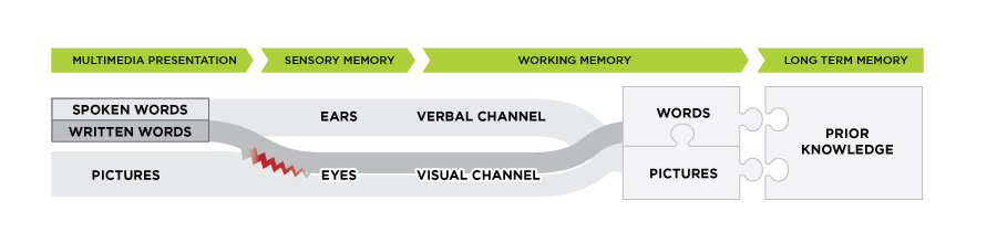
Adapted from “Cognitive theory of multimedia learning,” by R. E. Mayer, 2009, Multimedia Learning, p. 61. © 2001 by Richard E. Mayer.
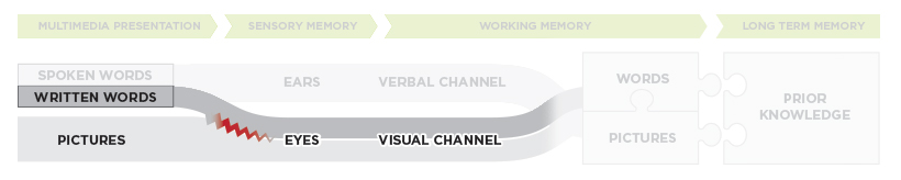
As depicted in the visual above, we possess two channels for processing information in working memory:
- a visual channel for processing visual information (information that comes through our eyes); and
- a verbal channel for processing verbal information (information that comes through our ears).
Importantly, each channel has limited processing capacity. This means that when designing online learning material, we need to make sure that we are not overloading one channel at the expense of the other (causing information traffic jams, or, in Mayer’s words, cognitive overload). To help learners learn efficiently, it is best to engage the visual and verbal channels simultaneously.
Key take-away 1:
Avoid cognitive overload – engage both channels
Helping learners process information efficiently is an important starting point when designing online learning material. But it’s only a start. In order for meaningful learning to occur, Mayer tells us that learners need to actively process material in each channel. They do this by
organizing it into a coherent representation
integrating it with other knowledge
Engaging in these processes helps learners to construct a coherent schema or model, which allows them to construct meaning. To encourage meaningful learning, therefore, we design online content to facilitate the cognitive processes of selecting, organizing, and integrating information.
...instructional design involves not just presenting information, but also presenting it in a way that encourages learners to engage in appropriate cognitive processing.
(Mayer, Multimedia Learning, p. 168)
Key take-away 2:
Help learners select, organize, and integrate information
How do we help learners select, organize, and integrate information?
First of all, we use multimedia (defined as words paired with pictures):
Presenting an explanation with words and pictures results in better learning than presenting words alone.
(Mayer, Multimedia Learning, p. 239)
So, our starting place in designing content for online learning is that multimedia helps learners learn. But only if done right. Here are three things that make it right, according to the work of Mayer and his colleagues:
- Reduce extraneous processing (i.e., minimize distraction)
- Manage essential processing (i.e., help learners process new material)
- Foster generative processing (i.e., help learners construct a model/schema)
![]()

© University of Waterloo.
Sweating the details
1.
Reduce extraneous processing
(or, minimize distraction)
There are 4 principles we can follow when designing online content to minimize distraction:
Coherence Principle
Leave out unnecessary words, sounds, and pictures
Unnecessary words, sounds, and pictures are considered "seductive details" - they interfere with knowledge construction because they direct learners' attention away from relevant material and towards non-essential material, which may disrupt learners' ability to build an appropriate mental model.
...adding extraneous info gets in the way of [the] structure-building process
(Mayer, Multimedia Learning, p. 106)
Make something consciously cute where the cuteness is extraneous, irrelevant to the task, and you get frustration, irritation, and resentment.
(Norman, Emotional Design, p. 111))
A few examples of coherent design follow. In each example, you’ll notice well-structured content that uses lots of white space, does a great job of depicting spatial relationships, and only uses images when they contribute to the experience of reading the text.
Example: Coherence
![]() bet100
bet100
Reprinted from “Unit 1a, Your Journey” by L. Smith, D. Rose, G. Malleck, 2015, BET 100. Copyright 2015 by L. Smith, D. Rose, G. Malleck and University of Waterloo. View Full Size
This screenshot from BET 100 illustrates coherent design in its use of white space, spatial relationships, and minimalistic images that contribute to the experience of reading the text.
Example: Coherence
![]()
Reprinted from “Module 3a, What is Intelligence?” by V. Nusca, 2014, PSYCH 213R. Copyright 2014 by V. Nusca and University of Waterloo.
This screenshot from PSYCH 213R illustrates coherent design in its use of white space, spatial relationships, and minimalistic images that contribute to the experience of reading the text.
Signaling Principle
Point out important material
Cues help learners select and organize key material. These cues may include verbal (e.g., headings, outlines, vocal emphasis) or visual (e.g., arrows, colours, pointing gestures, bolding, graying out). University of Waterloo learners who participated in user research on the UXDL framework emphasized the important role that signaling plays in online learning:
The Student Experience
. . . since this module was really organized and all the key words were highlighted already, it would be really easy for me to find a term I didn’t understand and then have the text clarify it for me.
(Troop et al., 2020)
Note: Signaling is most effective when used sparingly.
Example: Signaling
![]()
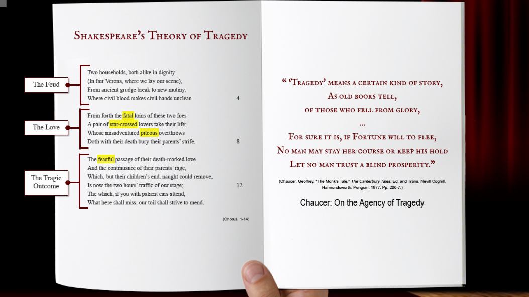
Reprinted from “The Chorus,” by. T. McGee, 2015, ENGL 362/DRAMA 386. Copyright 2015 by T. McGee and University of Waterloo.
In ENGL 362/DRAMA 386, the course author signals important information in two ways: first, by using labels to make the structure of the text explicit, and secondly, by highlighting key words in the text.
Example: Signaling
Creator. (Date). Title. Retrieved from URL.
Reprinted from “Module 2.1, The Molecular Nature, Determining Molecular Speed” by J. Grove, 2016, CHE 102. Copyright 2016 by J. Grove and University of Waterloo.
In this video, which describes molecular speed, key components of the figure are highlighted or emphasized as they are discussed by the course author. Signaling information in this way allows students to focus on important information as it is being discussed.
Redundancy Principle
Avoid duplicating narration with on-screen text
Printed words compete with images in the visual channel, risking cognitive overload.
![]()
Adapted from “Cognitive theory of multimedia learning,” by R. E. Mayer, 2009, Multimedia Learning, p. 61. © 2001 by Richard E. Mayer.
It's better to use pictures with words:
...the most efficient way to present verbal material is through the verbal channel - that is, as spoken text only - because in this way it does not compete with pictures for cognitive resources in the visual channel.
(Mayer, Multimedia Learning, p. 124)
Learners presented with printed text and narration may try to reconcile the printed text with the narration, wasting cognitive resources that could be better used to construct meaning. The following video provides a succinct description of the redundancy prinicple while also demonstrating how it works.
Mark Marino. (2021, February 9). Mayer's Redundancy Principle. [Video]. YouTube. https://www.youtube.com/watch?v=lhoOckxJ1GY
Did you find yourself trying to read the on-screen text, pay attention to the organizational visual, AND listen to the narration at the same time? You probably didn’t end up doing any of these tasks particularly well. Why not? Well, first of all, your visual channel was overloaded, trying to process both the organizational visual and the on-screen text. But more importantly, you were probably trying to reconcile the on-screen text with the narration, and used your working memory capacity to do this work rather than try to construct meaning from the narration. This is clearly not an efficient use of your working memory. As Ayers points out, when two sources of information contain the same information, “unnecessary working memory processing takes place trying to integrate the two sources” (Ayers, p.632). Learners should be encouraged either to listen to video recordings or to read the text version, but not both at the same time.
A much better way to present video content is to pair narration with pictures rather than text, making use of both the visual and verbal channels. Here’s an excellent example of video designed with this principle in mind:
Example: Redundancy
Creator. (Date). Title. Retrieved from URL.
“Essentials of Entrepreneurial Behaviour”. Reprinted from “Unit 3a, Push of Competition, Pull of Opportunity” by L. Smith, D. Rose, G. Malleck, 2015, BET 100. Copyright 2015 by L. Smith, D. Rose, G. Malleck and University of Waterloo.
This video excerpt provides an excellent example of the redundancy principle. In it, narration is paired largely with pictures rather than text, allowing learners to focus on constructing meaning rather than reconciling two sources of information (printed words and spoken words). Some text does appear, but it is short and kept to a minimum.
There are, however, certain conditions under which text can be paired with narration, and learning isn't negatively impacted.
These include:
- when captions are short, and placed next to graphics (see spatial contiguity);
- the narration is presented before the printed text rather than concurrently;
- there are no graphics; and
- the narration is short.
Recent research further suggests that redundancy may not affect learning when the subject matter is not theoretical (Ozdemir, Izmirli, Sahin-Izmirli, 2016). For example, Ozdemir and colleagues (2016) found that redundancy did not negatively affect learning when participants in their study were learning how to use Adobe Flash (an applied subject).
There are also conditions under which printed text is preferable to narration — see the reverse modality effect in the Modality Principle section below.
Spatial/Temporal Contiguity Principles
Place pictures and related text close together, and have them appear at the same time
Spatial contiguity refers to the spatial placement of text in relation to pictures: when text and pictures are not integrated, learners' attention is split (Ayres, 2015), resulting in extraneous cognitive load. Integration design is the goal. Here's an example:
Example: Spatial Contiguity
![]()

University of Waterloo. Brain illustration © seamartini, iStock / Getty Images Plus
In the image on the left, labels describing the various sections of the brain are separated from the image of the brain, so that students have to search the legend to make sense of the image. This kind of extraneous processing directs cognitive effort away from the meaning-making process. It is rectified in the image on the right, where words are integrated into the image.
Learning is further improved when learners are allowed to place the text next to the relevant parts of an image themselves, rather than seeing them already labelled. This kind of interactivity actively engages learners in cognitive processing. (See Foster Generative Processing below.)
Temporal contiguity refers to the temporal placement of text in relation to pictures: they should be presented simultaneously rather than successively:
![]()

Adapted from “Cognitive theory of multimedia learning,” by R. E. Mayer, 2009, Multimedia Learning, p. 61. © 2001 by Richard E. Mayer.
The following video from CHE 102 provides a good example of both temporal and spatial contiguity:
Example: Spatial/Temporal Contiguity
Creator. (Date). Title. Retrieved from URL.
Reprinted from “Module 2.1, The Molecular Nature, Determining Molecular Speed” by J. Grove, 2016, CHE 102. Copyright 2016 by J. Grove and University of Waterloo.
This video excerpt provides an example of both spatial and temporal contiguity. Labels are presented next to the key components they refer to (spatial contiguity), and appear onscreen when they are first mentioned in the narration (temporal contiguity).
2.
Manage essential processing
(or, help learners process new material)
Eliminating the things that cause extraneous cognitive overload is the first step in designing online content that is pedagogically useful. However, we still need to deal with the cognitive overload that arises when essential material is cognitively demanding or complex, or when learners are novices. Mayer calls this essential processing overload.
There are 3 principles we can follow to help learners avoid this kind of overload, and to help them better process essential material:
Segmenting Principle
Break content into shorter, user-controlled chunks
This principle is fairly intuitive: intellectually, it is MUCH easier to digest shorter lecture segments than long, continuous presentations of material (Mayer, p. 177), both for text- and video-based lectures. User research on the UXDL framework further reveals important motivational and attentional benefits of segmenting for some learners:
The Student Experience
...it was easy to read. It was all really organized and it wasn't too long. It was broken up into sections. So, it didn't seem, ... overwhelming.
(Troop et al., 2020)
The Student Experience
...the text was relatively easy to read, especially … the way it’s split up … I really liked because it’s not these big honking paragraphs that you’re just kind of looking at, like, I can’t believe I have to read this.
(Troop et al., 2020)
When segmenting isn’t applied, the resulting negative affect can easily short-circuit instructional goals, as the following learner expresses:
The Student Experience
...my attention is more drawn to the time bar and how long this video actually is.... I’m honestly really zoned out right now. I’m not sure what he’s talking about anymore, nor am I even trying to pay attention anymore.
(Troop et al., 2020)
The question often raised about segmenting is, "How small is small enough?" Opinion varies on this front. Guo (2013), in his research on Massive Open Online Courses (MOOCs), found that video-based lecture viewing dropped off after 6-9 minutes (among certificate-earning learners):
![]()

Guo, P. (2013, November 13). Optimal Video Length for Student Engagement. Retrieved from https://blog.edx.org/optimal-video-length-student-engagement?track=blog
Peters (2014) is a little more generous, citing Scott Klemmer’s Stanford Human-Computer Interaction course on Coursera as a good model for video-based lectures. In Klemmer's course, lectures are segmented into topic chunks of 10-20 minutes each (Peters, p. 190).
For slide-based presentations, learning material can be further segmented by restricting the presentation of content to one important concept per screen (Gutierrez, 2016).
For text-based learning material, use paragraphs and subtitles to segment. Walls of text can quickly overwhelm learners — use white space to provide “a visual breather”(Gutierrez, 2016).
Pre-training Principle
Introduce names and characteristics of main concepts first
Pre-training involves introducing learners to the names and characteristics of the main concepts to be covered in a lesson. It is designed to instill prior knowledge of key concepts, and, as Mayer explains, it works by "off-load[ing] some of the essential processing [from the lecture] onto the pre-training episode" (pp. 192-3). This increases learners' available cognitive capacity during the lecture, and allows them to devote more cognitive resources to understanding the material, which makes deeper learning possible.
In an online learning context, the “pre-training episode” can be delivered on the module page, before learners access the lesson content. In this example from PSYCH 101, for instance, learners are introduced to “New Terms and Concepts” before they access the lecture material:
Example: Pre-training
![]()
Reprinted from “Module 1, Memory” by P. Wehr, 2017, PSYCH 101. Copyright 2017 by P. Wehr and University of Waterloo.
This module page from PSYCH 101 illustrates the pre-training principle by introducing students to “New Terms and Concepts” before they access their lecture material. It also illustrates the segmenting principleby delivering lecture material in shorter chunks (numbered a – e) rather than one long file or presentation.
Modality Principle
Have pictures, not text, accompany narration
Pictures paired with spoken words generate deeper learning than pictures paired with printed words.
![]()
Adapted from “Cognitive theory of multimedia learning,” by R. E. Mayer, 2009, Multimedia Learning, p. 61. © 2001 by Richard E. Mayer.
...the best way to present words and pictures in a computer-based environment seems to be as a concise narrated graphic.
(Mayer, Multimedia Learning, p. 219)
This seems counter-intuitive for those of us out there (and I'm sure there are many!) who prefer to learn by reading printed material. We may well ask, "What is the rationale for this principle?" The answer echoes the rationale for pre-training — it's all about managing cognitive processing. In short, presenting words as narration "off-load[s] some of the essential cognitive processing from the visual channel to the [verbal] channel" (Mayer, p. 203).
The following video from PSYCH 213 provides a good example of the modality principle:
Example: Modality
Creator. (Date). Title. Retrieved from URL.
Reprinted from “Module 3b, What is intelligence?, IQ Scores” by V. Nusca, 2014, PSYCH 213R. Copyright 2014 by V. Nusca and University of Waterloo.
Narration is paired with visuals instead of written text in this video about IQ scores, reducing cognitive load and allowing students to focus on essential information.
Is this always the case?
No. Very few things in life come without conditions. In terms of the modality principle,
- the effect is strongest when the material is complex and when learners are novices;
- some researchers have found a reverse modality effect: that is, owing to its transient nature, lengthy spoken text can be detrimental to learning compared with printed text, which is more permanent and can be revisited (Ayres, p. 632).
- a recent study has also shown that replacing narration with text may be beneficial when learning spatial relationships (Inan et al., 2015)
To mitigate the reverse modality effect, we recommend segmenting narration into bite-sized chunks (see Segmenting Principle), and, where possible, supplementing it with a permanent written record, which can be provided to learners as an alternate format.
The big take-away in terms of helping learners to manage essential processing, then, is to design online instruction in ways that are congruent with the dual-channel, limited capacity way our brains process information. All of the principles outlined on this page become common-sense when we understand how our brain processes information.
3.
Foster generative processing
(or, help learners construct a model/schema)
Now that we've eliminated potential distractors from learning and helped learners better process essential material, we need to turn our attention towards helping learners to construct a model or schema of the material. This is what Mayer calls "fostering generative processing" — it essentially means helping learners organize and integrate visual and verbal representations of the material, and then integrate this new material with relevant prior knowledge.
![]()
Adapted from “Cognitive theory of multimedia learning,” by R. E. Mayer, 2009, Multimedia Learning, p. 61. © 2001 by Richard E. Mayer.
Learners who engage in generative processing may seem to be passive (that is, they are not engaging in behavioural activity — they are not visibly "doing" anything), but cognitively, they are active. Mayer is very clear on this point:
...well-designed multimedia instructional messages can promote active cognitive processing in learners even when they seem to be behaviorally inactive.
(Mayer, Multimedia Learning, p. 22)
There are 3 principles we can follow to help learners organize material and integrate it with prior knowledge:
Mayer describes this principle as "the most fundamental principle of multimedia design" (p. 240); it is so fundamental that it bears quoting him at length:
a deeper kind of learning occurs when learners are able to integrate pictorial and verbal representations of the same [instructional] message. This deeper processing can be called generative processing. Rather than adding information to memory, learners are actively constructing pictorial and verbal mental models and trying to understand how they are related to one another.
(Mayer, Multimedia Learning, p. 240)
Presenting words with graphics is crucial because it helps learners to engage in active cognitive processing.
User research further highlights the important motivational and attentional benefits of mixing different types of media (e.g., text, images, video, interpolated questions), as expressed by the following learners:
The Student Experience
I get super, super distracted.… I have a really, really low attention span, so when it comes to reading ... if this was just all text, no pictures, and just all text, I feel like I would be drifting all the time. But having the break with the pictures and the video, I stay more focussed on it.
(Troop et al., 2020)
The Student Experience
I found it engaging and I found that ... the fact that it ... switched up and the content was presented in varied ways ...helped that engagement happen.
(Troop et al., 2020)
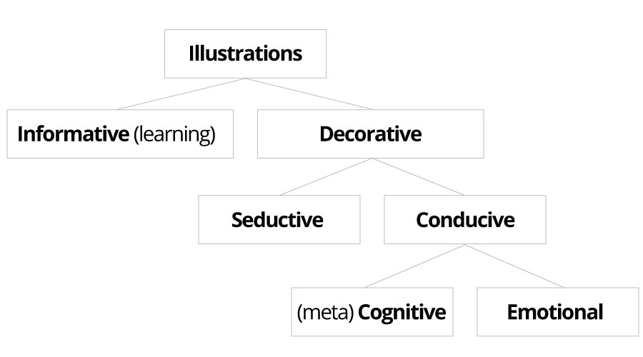
While pictures can be beneficial to learning, it is important to acknowledge that not all graphics are created equal – not, at least, in pedagogical terms. Mayer (p. 236) identifies four types of graphics used in instructional material:
![]()

© clairevis, iStock / Getty Images Plus
Decorative
these are added to generate interest or entertain the learner
![]()

© d1sk, iStock / Getty Images Plus
Representational
these portray a single element rather than relationships between elements; while related to the instructional message, they do not add further explanatory power to the text;
Decorative visuals can be further broken down into three subcategories – seductive, conducive-emotional, and conducive-metacognitive (Schneider, Nebel, & Rey):
![]()
© University of Waterloo (2017)
![]()
© clairevis, iStock / Getty Images Plus
Seductive
do not enhance the instructional message.
![]()

“Whitefish Falls, Ontario”. Reprinted from “Module 1, Introduction” by J. Johnston, 2017, EARTH 121. Copyright 2017 by J. Johnston and University of Waterloo.
Conducive - Emotional
these images can have a positive effect on learning when positive emotions are evoked.
In EARTH 121, the course author uses the following image to engage students in an activity designed to help them take notice of their environment in a different way than ever before. This particular image was selected to prompt students to carefully observe, track, and interpret hidden clues in the landscape. The activity provides opportunities for students to actively construct ideas, a process further enhanced through the positive affect created by the image.
![]()

Flag of the United States.svg, inverted, Public Domain, https://en.wikipedia.org/w/index.php?curid=17418528 on September 16, 2016.
Conducive - Metacognitive
these are images that can have a positive effect on learning by acting as a retrieval cue for learners when placed in proximity to a course concept.
The following visual of an American flag in inverted colours acts as a retrieval cue for the concept of trichromatic theory, which is explained in the text that immediately precedes the image in a PSYCH 101 module on visual perception.
Research suggests that only organizational, explanative, and conducive decorative visuals promote learning. User research further supports these findings – as one learner explains, these kinds of visuals helps them actively process new concepts and increases cognitive engagement:
The Student Experience
...a lot of the illustrations helped me sort of visualize and sometimes [see] the concept. And ... that is what would keep me engaged.
(Troop et al., 2020)
In order to design useful online content, therefore, use these types of visuals, and use decorative visuals (even conducive ones!) sparingly.
We revisit conducive images and discuss the importance of emotional design in more detail on the Desirable page.
Here's an example of an organizational visual in a technical writing course (explaining how a technical work-term report bridges work terms with academic terms):
Example: Organizational Visual
![]()
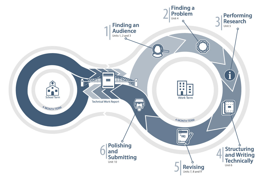
Reprinted from “Unit 1, What is a Work Report?” by. J. Dolmage, 2016, PD 11. Copyright 2016 by J. Dolmage and University of Waterloo.
This concept map illustrates how technical work-term reports “fit” in the undergraduate learning experience of co-op students at the University of Waterloo. The report straddles the worlds of school term and work term, and bridges the learning in each world. The concept map also visually depicts the process students should undergo when writing a technical work-term report.
Under what conditions does the multimedia principle hold true?
- it benefits learners with low prior knowledge most (Mayer, p. 238);
- some researchers have discovered an expertise reversal effect: for high knowledge learners, "providing diagrams alone can be superior to diagrams and text" (Ayres, p. 632).
Personalization/Voice Principles
Use a conversational style
Online learning can be viewed as an implied conversation between the learner and the instructor: picture a learner sitting alone at her computer, "listening" to the instructor through her computer speakers or headphones. Given this, it makes sense to address your learners as you would in a conversation. Communicating in a conversational style increases learners' feelings of social presence (sense of relationship with the instructor), which, in turn, increases learners' motivational commitment to make sense of the conversation (Mayer, p. 244).
Example: Personalization
Keep this in mind
Did you ever wonder why you are taught what we teach you? Let me put that another way ... did you ever question why you need to learn calculus, or chemistry, or statistics, or economics? How does an engineering program such as ours decide what courses you should take and what topics should be covered? The simple answer is this ... the engineering profession tells us what to do.
Reprinted from “Unit 1, “Having a Logical Approach” by P. Teertstra, 2016, PD 21. Copyright 2016 by P. Teertstra and University of Waterloo.
In this example, the professor does an excellent job of using a conversational tone when introducing students to the role that professional accreditation boards hold in outlining curricular requirements.
Personalization can also involve including stories and/or examples that allow learners to relate to the content and instructor. The following video provides a great example of this:
Example: Personalization
Creator. (Date). Title. Retrieved from URL.
Reprinted from “Module 1.1, Introduction to Public Health” by J. Atkinson, 2016, Oncore-Encours. Copyright 2016 by J. Atkinson, Peel Health, and University of Waterloo.
Both the conversational tone and the content of this video (a personal story) are examples of personalization. This is the first video that students are presented with in the Oncore/Encours course, allowing the course author to build a connection with students from the outset. Using personalization to help students relate to the content and the instructor can increase students’ motivation.
Of course, too much of a good thing can be a bad thing: extraneous conversational strategies can be distracting too (Mayer, p. 254). Be personable, but within the context of the subject matter.
Image Principle
Humanize learning
Simply adding an instructor's image (e.g., a "talking head") to the screen has not been shown to promote learning (Mayer, p. 260). In fact, it is potentially distracting (Fiorella & Mayer, 2015). However, human demonstration, — in particular, showing an instructor's hands drawing an explanative or organizational visual, does promote learning:
...observing the instructor make drawings while orally explaining a topic can promote student learning, and further, that there may be unique [e.g., motivational] benefits associated with the presence of a human instructor's hand during the lesson.
(Fiorella & Mayer, "Effects of observing the instructor draw diagrams on learning from multimedia messages", p. 14)
It is important to note that other approaches, such as drawing out a concept without instructor presence, or presenting a video in which the instructor points to a static image to highlight key points, do not improve learning outcomes to the same degree as human demonstration (Fiorella & Mayer, 2015). This is a relatively new, but growing, area of research.
Here are a few examples of human movement being used to promote student learning:
Example: Human Movement
Creator. (Date). Title. Retrieved from URL.
Reprinted from “Week 10, Kinetic Energy of Rolling Motion and Angular Momentum, Rolling Motion Demonstration” by J. Sanderson, 2015, PHYS 111. Copyright 2015 by J. Sanderson and University of Waterloo.
In this video, Professor Joe Sanderson uses human movement to demonstrate principles associated with rolling motion.
Example: Human Movement
Creator. (Date). Title. Retrieved from URL.
Reprinted from “Video Experiments, Lenz’s Law, Transformer, and Generator Demonstration” by S. Idziak, 2015, PHYS 112. Copyright 2015 by S. Idziak, J. Sanderson and University of Waterloo.
Professor Stefan Idziak uses human movement to demonstrate how moving a magnet in and out of a coil of wire results in changes in electrical current.
Example: Human Movement
Creator. (Date). Title. Retrieved from URL.
“Water in the Geosphere”. Reprinted from “Module 6, Water” by J. Johnston, 2017, EARTH 121. Copyright 2017 by J. Johnston and University of Waterloo.
Professor John Johnston from EARTH 121 points out the connections between parts of the geosphere and brings the topic to life through the combination of (a) personalized voice and (b) hand-drawn visuals.
Renkl's Principle
Demonstrate with worked examples
Providing learners with worked examples (step-by-step solutions to problems) has been found to be particularly effective for novices (Ayres, 2015), whereas experienced learners benefit most from answering open-ended questions with supporting arguments (Leppink, Broers, Imbos, van der Vleuten, & Berger, 2012). Worked examples scaffold learning by making problem-solving techniques visible, thus reducing cognitive load. As learners' conceptual understanding increases, this kind of scaffolding can gradually fade; e.g., worked examples can give way to partially worked examples, and eventually to open-ended questions.
Here’s an example of a worked example in which a sentence in the passive voice is transformed into active voice:
Example: Worked Examples
![]()
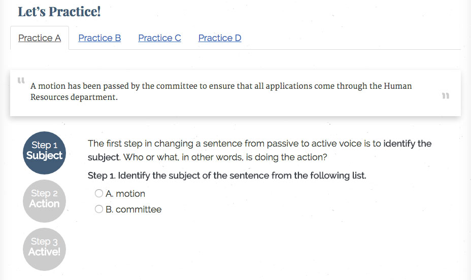
Reprinted from “Waterloo Writing Works: Active Voice” by. J. Dolmage, 2016, PD 11. Copyright 2016 by J. Dolmage and University of Waterloo.
The exercise makes visible the grammatical transformations necessary to convert a sentence from passive to active voice. It does this by breaking the task into three distinct parts:
- First, students identify the subject;
- Next, they identify the action being performed by the subject;
- Finally, they construct the active voice version of the sentence.
And here’s a math example, where students are shown matrix-vector multiplication by rows:
Example: Worked Examples
Creator. (Date). Title. Retrieved from URL.
Reprinted from “Matrix Multiplication and Properties” by D. Wolczuk, 2013, MATH 136. Copyright 2013 by D. Wolczuk and University of Waterloo.
This exercise shows students how to multiply a matrix by a vector using the rows of the matrix by working through a specific example. It highlights the specific pieces of the matrix and vector that are being considered in each calculation and shows an intermediary step to help clarify how to arrive at the final answer.
The Testing Effect
Provide opportunities for retrieval practice
Related to the efficacy of worked examples is retrieval practice, often referred to as the testing effect in the literature. Research suggests that students learn better, retain new knowledge longer, and are better able to transfer it to new contexts when they are tested on it or test themselves (Roediger & Butler, 2010). Learners who participated in the UXDL user research study indicated that they seek these kinds of practice opportunities:
The Student Experience
I try to do a lot of practice questions. Like it’s good that there are practice questions here, but it would be nice if there were more.
(Troop et al., 2020)